A product can be excellent and still get ignored on the shelf or in a delivery box if the packaging feels unclear, generic, or cheaply made. If you are figuring out how to design product packaging, the real job is not just making it look good. It is making sure it attracts attention, explains the product fast, protects what is inside, and can be produced reliably without wasting time or budget.
That balance matters whether you are launching a startup product, updating retail boxes, packaging restaurant items, or preparing branded kits for an event. Good packaging design is part branding, part sales tool, and part production planning. When those three parts work together, your packaging does more than hold a product. It helps move it.
Start with the product, not the artwork
One of the most common mistakes is starting with colors, fonts, and visual references before defining what the packaging actually needs to do. A candle box, a takeaway food sleeve, a cosmetic carton, and a promotional gift box all have different performance requirements. The right design starts with the product itself.
Size, weight, fragility, shelf life, and handling conditions should shape the packaging format from day one. If the product is delicate, structure matters more than decoration. If it sits in a crowded retail environment, front-panel clarity becomes critical. If it is shipped directly to customers, durability and opening experience both need attention.
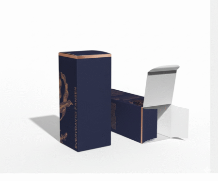
This is also where budget realities come in. Rigid boxes may look premium, but they are not always the right choice for every product or every order size. Folding cartons, sleeves, labels, pouches, and corrugated mailers each solve different problems. Smart packaging design is not about choosing the most expensive option. It is about choosing the format that fits the product, the brand, and the sales channel.
How to design product packaging with a clear brand role
Packaging should look like your brand, but it also needs to work harder than a logo placement exercise. Customers usually give packaging a quick glance before they decide whether to pick it up, trust it, or move on. That means the design has to communicate quickly.
Start by deciding what the package must say at first glance. For some products, that is premium quality. For others, it is convenience, freshness, gift appeal, or value. A minimalist design can look sophisticated, but only if the product category supports it. In a busy retail setting, minimal packaging sometimes disappears next to bolder competitors.
Your brand colors, typography, imagery, and tone should support that first message. If your business is modern and clean, the packaging should reflect that consistently. If your audience expects warmth, heritage, or handcrafted quality, the design should feel appropriate. Consistency builds trust, especially when customers see your products across boxes, labels, bags, inserts, and promotional materials.
Prioritize hierarchy before decoration
Many packaging designs fail because they try to say everything at once. The result is cluttered layouts, tiny text, and no clear focal point. Strong packaging uses visual hierarchy so the buyer knows where to look first, second, and third.
Usually, the brand name, product name, and one key benefit deserve top priority on the main panel. After that, supporting details like size, flavor, features, care instructions, or ingredients can follow in a logical order. If everything is bold, nothing stands out.
This is especially important for brands with multiple product variations. A packaging system should make it easy to recognize the overall brand while also distinguishing one item from another. Color coding, pattern shifts, or structured label zones can help create that balance without redesigning every SKU from scratch.
Choose materials that match the product experience
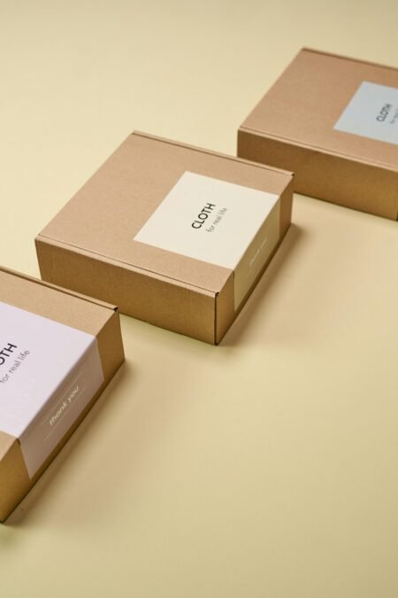
Material selection changes how customers perceive value before they even touch the product itself. Matte finishes can feel refined. Gloss can create energy and impact. Kraft board can suggest natural or handmade positioning. Transparent labels can feel modern, but only if the container and print quality support that look.
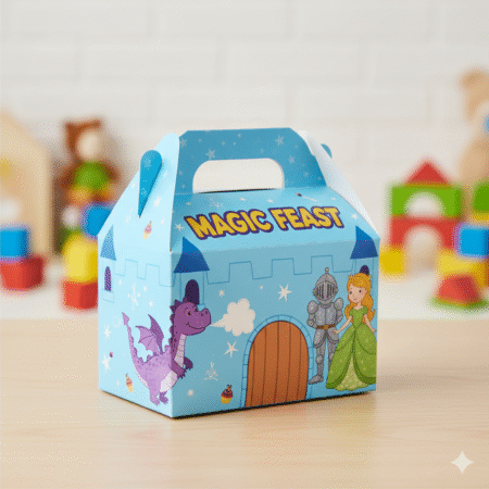
There is no single best material for every packaging project. It depends on use case, storage conditions, transportation, and budget. Food packaging needs a different level of consideration than retail gift boxes. Cosmetic labels may require resistance to moisture or oils. Event packaging may need visual impact at a short viewing distance, while e-commerce packaging has to survive shipping.
Production method matters too. Some designs look strong on screen but become difficult or costly once specialty finishes, color consistency, or short-run requirements enter the picture. That is why it helps to think about print feasibility early. A practical production partner can often suggest adjustments that keep the design strong while making it faster and more cost-effective to print.
Make print-ready design part of the process
A polished concept is not enough if the final printed packaging comes out with shifted panels, weak color, or hard-to-read text. Designing for production is where many delays and avoidable costs happen.
Dielines need to be accurate. Bleeds and safe areas need to be respected. Small text should remain readable after printing and folding. Dark backgrounds, metallic effects, fine lines, and large solid color areas all need careful preparation. What looks sharp in a flat digital mockup may behave differently on actual packaging stock.
This is where close coordination between design and print makes a major difference. Instead of treating production as the final handoff, bring it into the conversation early. That saves revisions, protects deadlines, and reduces the risk of approving packaging that looks good on a laptop but underperforms in real life.
For businesses with tight launch schedules, this matters even more. Fast turnaround only works well when the design is built with production accuracy in mind.
Test how customers will actually see it
Packaging is rarely experienced in ideal conditions. It may appear on a crowded shelf, in a dim retail corner, inside a delivery box, or in a customer’s hand for only a few seconds. Good design needs to hold up in real settings, not just in presentation files.
Print a sample if possible. Place it near competing products. View it from a distance. Check whether the product name is instantly legible and whether the brand feels credible at first glance. If the packaging will be photographed for online sales, test how it appears in images too. Some designs that look premium in person lose impact on screen, while others photograph better than expected.
It also helps to watch for friction points. Is the box difficult to open? Does the label wrinkle on application? Does the information panel feel cramped? These details affect customer perception more than many businesses expect.
How to design product packaging for growth
Packaging should solve today’s need without creating tomorrow’s problem. A design that works for one product launch may become inefficient when the line expands, when order volumes increase, or when seasonal versions are introduced.
That is why scalable design systems matter. If you expect multiple sizes, scents, flavors, or collections, build a flexible structure now. Keep core brand elements consistent and allow selected parts to change easily. This saves time, controls costs, and makes future product rollouts much smoother.
It is also worth thinking beyond the primary package. Labels, shipping boxes, inserts, stickers, and point-of-sale materials all shape the customer experience. The strongest brands treat packaging as part of a complete printed ecosystem, not an isolated design project. When everything works together, the brand looks more established and more trustworthy.
For many businesses, speed is a factor just as important as creativity. Seasonal campaigns, retail deadlines, promotional events, and new product launches often move quickly. In those cases, the best packaging process is one that combines design support, production planning, and dependable execution in one place. That is where an experienced print partner like Doha Print can add real value, especially when timelines are tight and consistency matters.
Keep the message simple and the execution sharp
There is a temptation to overdesign packaging because the surface feels valuable and limited. But simple, confident packaging often performs better than overloaded layouts filled with extra claims, excessive effects, or inconsistent branding. Clarity sells.
The goal is not to impress a design committee. The goal is to help the right customer notice the product, understand it quickly, and feel confident enough to buy it. That may mean bold color and minimal copy. It may mean refined typography and premium finishing. It may mean a cost-efficient carton with strong labeling rather than an expensive box structure. It depends on the product, the audience, and where the package needs to perform.
The best packaging usually feels obvious once you see it. That is because every decision has a purpose – from material and structure to layout and print method. When you approach packaging with that level of clarity, you create something that looks professional, works in production, and supports sales without wasting effort.
If you are planning your next packaging project, aim for something your customers can understand in seconds and remember after the product is gone.