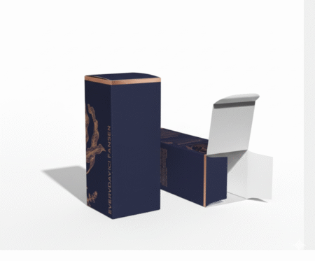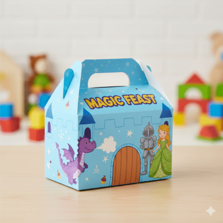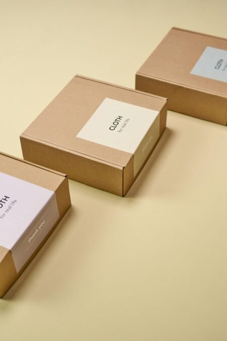

A customer may only spend a few seconds deciding whether your product looks trustworthy, giftable, premium, or worth trying. That decision often happens before they read the product details. This custom packaging design guide helps you make those seconds count with packaging that protects what you sell, presents your brand clearly, and works within a practical production budget.
For a startup launching its first product, a restaurant preparing takeaway boxes, or a retailer refreshing shelf presentation, the right packaging is not simply a container. It is a customer-facing business tool. Good design creates recognition. Good materials prevent damage. Good print production keeps every order looking consistent.
Start With the Job Your Packaging Must Do
The most attractive box is still a poor investment if it is the wrong size, breaks in transit, or creates a difficult unboxing experience. Begin by defining the job before choosing colors, finishes, or decorative details.
Ask what the package will protect, where customers will see it, and how they will use it. A candle box displayed in a boutique has different needs from a food container carried home in a car. A mailer for e-commerce must handle shipping pressure, while a cosmetics carton may need to communicate premium quality from the shelf.
Size is one of the first decisions to get right. Measure the product accurately, then allow appropriate space for inserts, protective wrapping, or product movement where needed. Oversized packaging can increase material and shipping costs. Packaging that is too tight can damage the product or make packing slow for your team.
Also consider your fulfillment process. If staff must pack hundreds of orders, a complicated box construction may reduce efficiency. A simple, well-designed folding carton can be a better commercial choice than an elaborate structure that takes too long to assemble. The best option depends on your product, volume, retail environment, and delivery method.
Choose Materials That Match Your Product and Positioning
Material affects protection, print appearance, cost, and the message customers receive. It should support the product rather than compete with it.
Paperboard and cardboard are widely used because they are versatile, printable, and suitable for many retail and food-service applications. A lightweight folding carton can work well for cosmetics, small gifts, and dry goods. Corrugated board is often the stronger choice for shipping boxes, heavier products, and subscription packaging.
For food packaging, material selection also needs to reflect the product’s temperature, moisture, grease, and holding time. A bakery box, coffee cup sleeve, and takeaway meal box require different levels of resistance and construction. Do not select a stock only because it looks good in a sample. Test it against real-world use.
Texture can reinforce brand positioning. Smooth coated stocks often create a crisp, polished appearance for detailed graphics and rich color. Uncoated or kraft-style materials can support a natural, handmade, or environmentally conscious feel. Neither is automatically better. A luxury skincare brand may benefit from a refined matte surface, while a local artisan food brand may feel more authentic with a simple natural board.
Build a Clear Visual Hierarchy
Packaging has limited space. Trying to say everything usually means customers notice nothing. Your design should tell people what the product is and why they should care without forcing them to search for the answer.
Place the brand name, product name, and key benefit in order of importance. On a retail shelf, the front panel must work from a distance. On an online order, the top or opening panel may be more important because it becomes part of the unboxing moment.
Use your logo consistently, but avoid making it the only visual element. Product photography, illustrations, color blocks, patterns, and typography can all help customers identify a product category quickly. A spice package should not resemble a phone accessory box. A children’s product should not look like a corporate document folder.
Color deserves careful planning because it influences both recognition and production cost. A tightly controlled palette can look stronger than a design filled with unrelated colors. If your brand already uses established colors, request print proofs or color references to keep future packaging consistent across boxes, labels, bags, and promotional materials.
Typography should remain readable at the actual printed size. Fine type may look sharp on a large screen but become difficult to read when printed on a small label or folded near a crease. Keep essential information away from folds, glue areas, cut lines, and edges. These small production details make the difference between a polished result and a package that feels rushed.
Design for Printing, Not Just for Screens
A packaging file needs more than an attractive front design. It must include the correct dieline, bleed, safe areas, folds, and panel placement. A dieline is the production template that shows where the package will be cut, folded, and glued.
Your artwork should extend beyond the final cut line with bleed, so color and images reach the edge cleanly after trimming. Important text, logos, and product details should stay inside the safe area. This protects them from minor movement during cutting and folding.
Images should be high resolution for print, and colors should be prepared for the required printing process. Screen colors can appear brighter than printed colors, especially on uncoated materials. A proof helps identify whether dark areas lose detail, light type needs more contrast, or a brand color requires adjustment.
If you are using metallic effects, spot colors, foil, embossing, or UV coating, plan these elements as separate production layers from the start. Adding specialty finishes late can require artwork changes and may affect timing. Clear communication with your print partner prevents expensive corrections after production begins.
Use Finishes Where They Add Value
Finishes can turn ordinary packaging into a more memorable brand experience, but they should serve a purpose. A matte lamination can create a soft, premium appearance and add surface protection. Gloss lamination can make colors look more vivid and can suit bold retail graphics.
Spot UV adds shine to selected areas, such as a logo, pattern, or product image. Foil stamping can create a distinctive premium detail for gift packaging, beauty products, invitations, or limited editions. Embossing and debossing add tactile interest that customers can feel before they even open the box.
The trade-off is cost and production time. A simple design with one strong finish often looks more intentional than a package using every available effect. If you are testing a new product or ordering a small quantity, prioritize a clean structure, readable design, and reliable print quality first. Specialty finishing can be introduced as sales volume grows.
Include the Information Customers Need
Packaging is part of your sales presentation, but it may also need to carry practical and regulatory information. Requirements vary by product category and market, so confirm what applies to your business before finalizing artwork.
Depending on the product, this may include ingredients, nutritional details, usage instructions, warnings, barcode space, batch information, expiry dates, or contact details. Plan for these early. Trying to fit mandatory copy into a finished design often leads to tiny text, cluttered panels, and last-minute reprints.
For products with changing details, such as flavors, sizes, dates, or batch numbers, consider using custom labels alongside printed packaging. This approach can be more flexible than printing every variable directly onto the box, particularly for short runs or frequent product updates.
Order Samples and Test the Real Experience
Never approve packaging based only on a digital file when the product is commercially important. A physical sample lets you check color, material feel, fit, folds, closures, and finish under normal handling conditions.
Pack the actual product. Stack the boxes. Carry them. If they will be delivered, test them with the shipping materials you plan to use. If they will sit on a shelf, place them next to competing products and assess whether the brand is easy to recognize.
This stage also helps uncover operational issues. Does the box open too easily? Does the label wrinkle around a curve? Is the product hard to remove? Does the package take too long to assemble? A small adjustment before a full run can protect your budget and your customer experience.
Work With a Print Partner Early
Packaging projects move faster when design and production are considered together. A capable print partner can advise on material availability, box styles, finishes, print methods, quantities, and realistic turnaround times before you commit to an artwork direction.
For businesses managing multiple customer-facing materials, using one provider can also help maintain visual consistency across packaging, labels, menus, inserts, flyers, and event displays. Doha Print supports custom packaging projects with practical design guidance and production options suited to both smaller orders and ongoing commercial requirements.
Bring a clear brief: your product dimensions, target quantity, preferred deadline, brand assets, and examples of packaging you like. This gives the production team what they need to recommend a solution that balances appearance, protection, speed, and cost.
Your packaging does not need to be complicated to make a strong impression. It needs to fit the product, communicate the brand with confidence, and arrive in customers’ hands looking exactly as intended.