
A product has only seconds to make its case on a crowded shelf, in a delivery box, or on a customer’s social feed. That is why packaging design trends 2026 are moving beyond decoration. The strongest packaging will make the product easier to recognize, easier to trust, and worth sharing.
For retailers, restaurants, startups, and established brands, the opportunity is practical: use packaging to create a polished customer experience without adding unnecessary cost or production delays. The right direction depends on your product, sales channel, order volume, and budget. Still, several clear design priorities are shaping what customers will expect next.
Packaging Design Trends 2026: Clearer, Smarter, More Tactile
Bold simplicity replaces visual clutter
Minimalism is not disappearing, but it is becoming more confident. Rather than using empty space simply to look premium, brands are using clear layouts, strong color blocking, and one memorable visual idea. A single large logo, an expressive product image, or a high-contrast pattern can do more work than several competing messages.
This approach is especially effective for food, beauty, wellness, and consumer goods where customers compare products quickly. Clear hierarchy matters: customers should be able to identify the brand, product type, key benefit, and variant without turning the package in their hands.
Simple does not mean plain. A clean box can still feel distinctive through a bold brand color, custom typography, embossed details, or a well-chosen finish. The trade-off is that every element becomes more visible, so design and print quality need to be precise. Small alignment errors, weak color matching, or low-resolution artwork stand out immediately on a simplified layout.
Tactile finishes create a reason to pick up the product
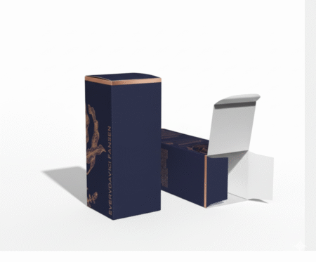
As online shopping grows, physical packaging has become one of the few direct sensory moments between a brand and its customer. That is driving demand for packaging people can feel. Soft-touch lamination, spot UV, raised effects, embossing, debossing, textured paper, and foil accents are being used to create contrast and reinforce quality.
The most effective use of tactile finishing is selective. A matte box with spot UV on the logo, for example, can look more refined than a fully glossy package. A subtle embossed mark may communicate craftsmanship better than a large metallic effect. Finishes should support the brand message, not compete with it.
There is a cost consideration. Premium finishing can increase unit cost and production time, particularly on short deadlines or highly detailed artwork. For a launch campaign, gift set, premium menu, or event package, that investment can be worthwhile. For high-volume everyday packaging, a strong uncoated stock or a single strategic finish may deliver better value.
Sustainability becomes easier to understand
Customers are paying closer attention to material choices, but they also want packaging that is easy to use and dispose of correctly. In 2026, clearer sustainability communication will matter as much as the material itself. A recyclable package that leaves customers unsure of what to do with it misses part of the point.
Expect more brands to choose right-sized boxes, reduced inserts, paper-based wraps, recyclable labels, and packaging structures that use less material. The design language is also changing. Instead of covering every surface with green graphics and environmental claims, more brands are using straightforward instructions and honest material information.
The best sustainable option depends on the product. Food, cosmetics, electronics, and fragile items have different protection requirements. Switching to a lighter material may reduce waste, but not if it leads to damage in delivery. A practical packaging partner can help balance durability, presentation, print compatibility, and cost before production begins.
Packaging built for the unboxing moment
Unboxing is no longer limited to luxury products. A neatly packed meal, a branded retail order, a welcome kit, or an event giveaway can all create a memorable moment when the details are considered. Customers notice the inside of the package, not only the exterior.
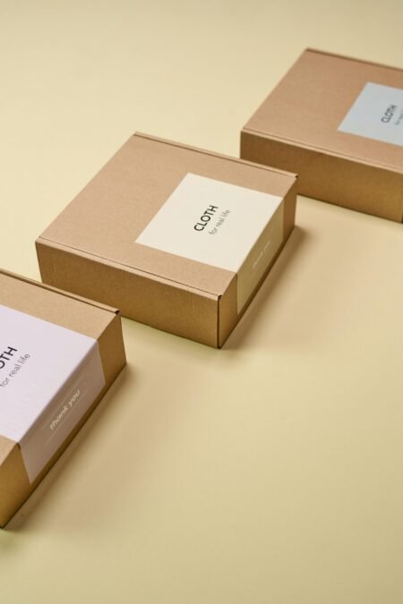
Printed tissue paper, branded stickers, thank-you cards, custom inserts, and inner-lid messages can add personality without requiring an elaborate box structure. For businesses with smaller order quantities, these components can be a cost-effective way to elevate standard packaging.
The key is consistency. If the outer package feels premium but the insert is poorly cut or the colors do not match the brand, the experience loses credibility. Keep the unboxing system focused on two or three coordinated elements, and make sure every item uses the same approved logo files, colors, and typography.
Smart Labels Are Becoming Part of the Design
QR codes and scannable elements are moving from an afterthought to a planned part of the layout. When used well, they connect physical packaging to menus, product instructions, loyalty offers, reorder pages, origin stories, or campaign content. For restaurants and food brands, a code can point customers to allergens, ingredients, or current promotions without overcrowding the label.
The code must be functional, high contrast, and printed at an appropriate size. Placing it over a busy image, using low contrast, or shrinking it too far can make it useless. Give it breathing room and a clear reason to scan, such as “See product care” or “Scan for rewards.”
Smart packaging should add convenience, not create friction. A customer should still understand the product without scanning anything. Think of the digital layer as an extension of the package, not a replacement for essential information.
Labels do more heavy lifting
For many products, the label is the package. This is particularly true for bottles, jars, takeaway containers, bakery boxes, candles, and promotional items. In 2026, brands will use labels more strategically to create variation without ordering a completely different box or container for every flavor, size, or campaign.
Digital label printing makes short runs, seasonal designs, and product testing more accessible. A startup can launch with a focused label system, learn which variants perform best, and update the artwork without committing to a large inventory of preprinted packaging. Established businesses can use the same flexibility for limited editions, corporate gifting, and event-specific branding.
Consistency still matters. Build labels around a repeatable system: fixed logo position, approved color palette, clear product naming, and room for compliance information. This gives your range a unified look while allowing each product to have its own character.
Packaging That Works Across Shelf, Delivery, and Social
The packaging design trends 2026 point to one central challenge: a package must perform in more than one place. It needs shelf impact, delivery protection, readable product information, and a good appearance in photographs. A beautiful box that crushes in transit will frustrate customers. A durable package with no visual appeal may struggle to earn attention.
Start the design process with the actual customer journey. Will the product sit in a retail display? Be delivered by courier? Be handed over at a counter? Be photographed at an event? The answer affects material thickness, closure style, print finish, label adhesive, and the amount of information needed on each panel.
For example, a restaurant packaging system may need grease resistance, quick assembly, stackability, and a visible brand mark for delivery photos. A skincare gift set may need a premium opening experience, protective inserts, and room for detailed usage information. Neither solution is better by default. Each is designed for its job.
Color choices become more intentional
Color remains one of the fastest ways to signal category and emotion, but the strongest brands are avoiding generic palettes. Expect saturated brights, earthy neutrals, deep jewel tones, and unexpected pairings used with more discipline. The goal is not to follow a color trend blindly. It is to create immediate recognition.
Before approving artwork, check how colors reproduce on the selected material and finish. A color on a screen can look very different on uncoated paper, kraft board, transparent film, or a textured surface. Requesting a proof or sample is a practical step, especially when brand color accuracy is central to the design.
Turn Trends Into a Production-Ready Package
Good packaging begins with a clear brief, not a collection of visual references. Define what the package must protect, how it will be packed and shipped, where customers will see it, and what action you want them to take. Then choose the format, material, printing method, and finishes that support those goals.
Keep artwork production-ready from the start. Confirm dielines, bleed, safe areas, barcode placement, label dimensions, and color requirements before finalizing the design. This prevents avoidable revisions and helps protect urgent launch schedules. It also makes pricing more accurate because the production team can recommend the right specification for your quantity.
Doha Print helps businesses bring these decisions together, from custom boxes and labels to branded inserts and promotional materials. Fast production is valuable, but it works best when the packaging plan is clear enough to move confidently from design approval to delivery.
The best packaging for 2026 will not chase every trend. It will make the customer’s choice feel easy: the product looks right, feels considered, arrives safely, and leaves a brand impression worth remembering.